ST IVES ৷ TATE
- Eleni Kyriacou
- Mar 20, 2019
- 2 min read
Updated: Sep 4, 2022
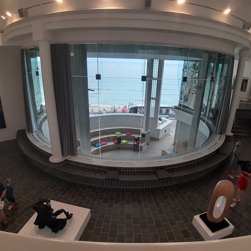
This Tate’s location makes it special, not just because of the fact that it is in St. Ives, honouring the local, artistic history and tradition but the fact that it is situated on the sea-front. The rich, permanent collection is carefully curated so as to having a relevance to St. Ives. Not only does the collection include many works that were created in St. Ives by artists who were either from St. Ives or who lived and worked there for a period, but it includes other prominent artists who were friends of the St. Ives artists and therefore influenced one another. For example the Nicholsons were friends with Mondrian who has a work included. Similarly, British artists who influenced and were influenced by St. Ives artists were also included. For example Henry Moore is showcased alongside Barbara Hepworth, an obvious pairing.

Tate, St. Ives
There are certain common threads that can be traced when wandering through the galleries. A certain naïve-like, incredibly honest, purity of line that you see in drawing and painting is very typical amongst St. Ives artists, such as: Alfred Wallis, Ben Nicholson, Winifred Nicholson, John Wells and Wilhelmina Barns-Graham, whether depictive or abstract, you see this stripped, totally unembellished, very sensitive use of line. I first came across this way of drawing in the work of Ben Nicholson, but one sees it amongst all these artists. I also saw it in the potters’ drawings at The Leach Pottery. There are also commonalities amongst these artists in their use of colour: bright colours, pastel colours and muted, sombre colours, but always ‘toned-down’, as though there is a veil of mist screening the colours. This does seem to arise from and echo the environment of St. Ives, the light, the nature, the entire ambience. This becomes obvious when you suddenly see a work by an artist who never worked in St. Ives, like the Mondrian, that quite literally pops out of the collection. Of course there are exceptions, Terry Frost and Patrick Heron use very vibrant colours, but I think it is a valid general observation, even Frost and Heron’s colours are not as sharp and stark as Mondrian’s.


